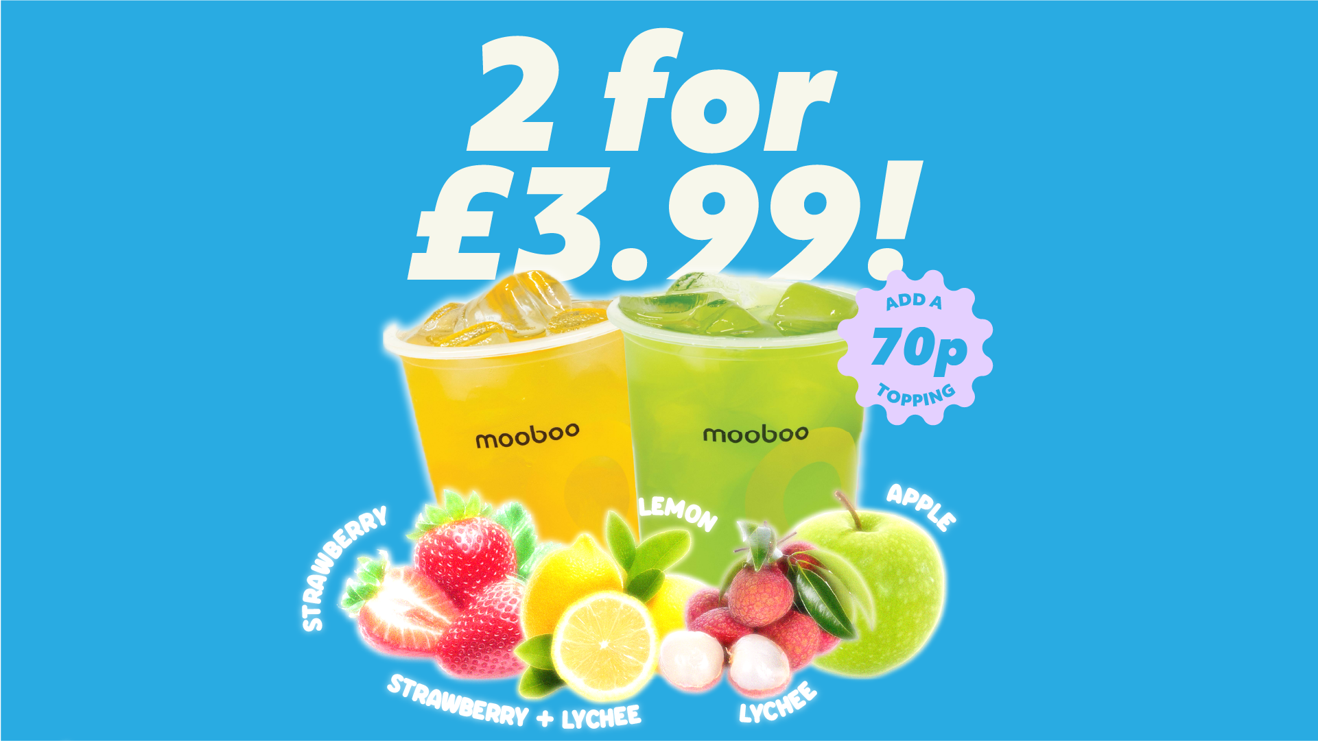
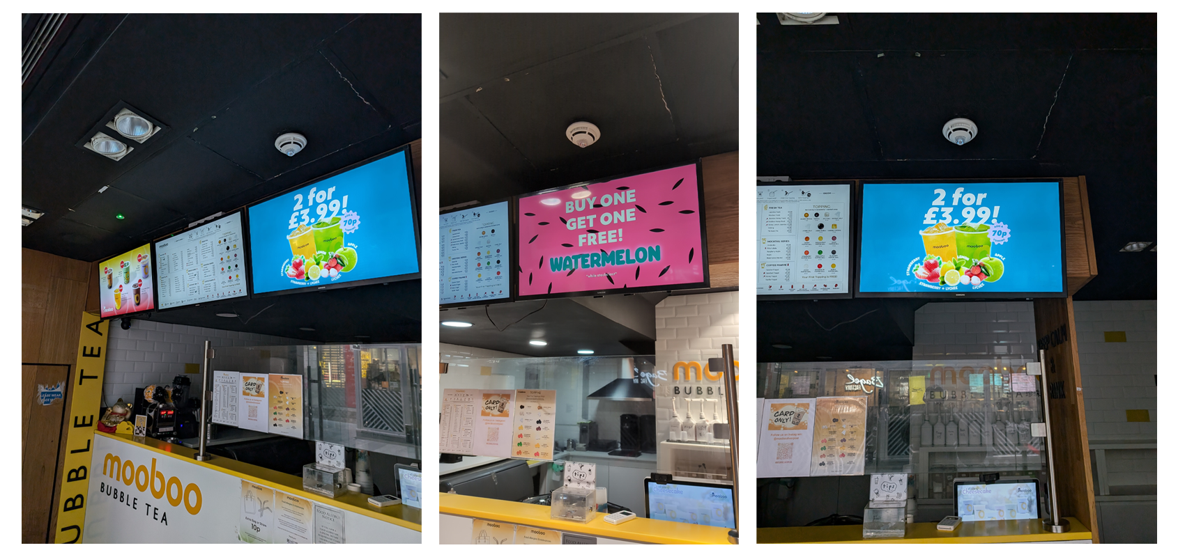
I was tasked with creating promotional designs for the in-store TV screens to encourage the sale of drink flavours that were about to run out of date. To create these designs I used a mix of company assets, personal digital illustrations and sourced some images online.
The aim was to create something colourful and engaging, bringing attention to the flavours that were available and to minimise confusion among customers. We wanted to be able to have as little to explain to the customers as possible, efficiency is important in the store.
The tips sign design has a handmade style to reinforce the fact that all of the cash tips go entirely to the staff. With the knowledge that those who want to tip will tip, the design adds personality to an otherwise blank and boring space.
The hand-drawn illustrations are imperfect and have a charm, the intention is to remind the customer that these are people and not just a transaction, although it is a transactional relationship by nature.